UI Layout
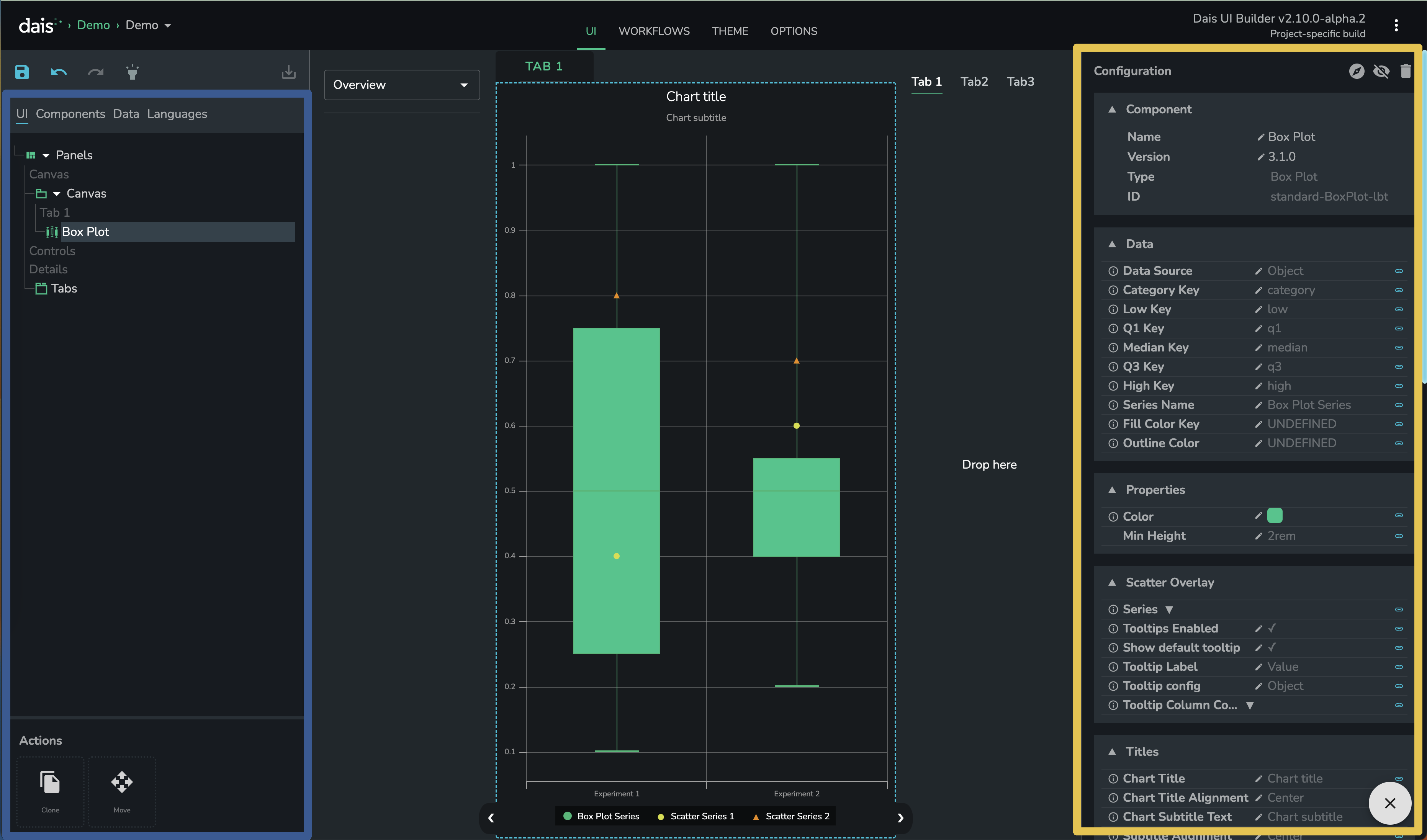
UI Tree
Marked on above screenshot in blue.
The hierarchy of your app components can be viewed with the components tree in the first tab of the far left-hand side panel. Also note the "Inspect" flashlight above this field—when the inspect mode is active, you can select a component by hovering over the design and clicking in its light-blue dotted area. Components can also be selected by clicking on the tree itself.
The Clone Selected and Move Selected options are another useful feature to familiarize yourself with. These two actions are drag & drop tiles - select component from tree or using "Inspect" flashlight and then drag one of these aciton tiles to your app.

Component configuration
Marked in yellow.
The 'nitty gritty' of everything you can customize is detailed in the properties field in the panel on far right-hand side of the UI builder. Properties are shown for the component that is currently selected.
Properties that are not shown in this field can not be customized at this time. In some cases, the Dais team are able to expose additional properties to the UI builder so please discuss any feature requests with them.
Component Library
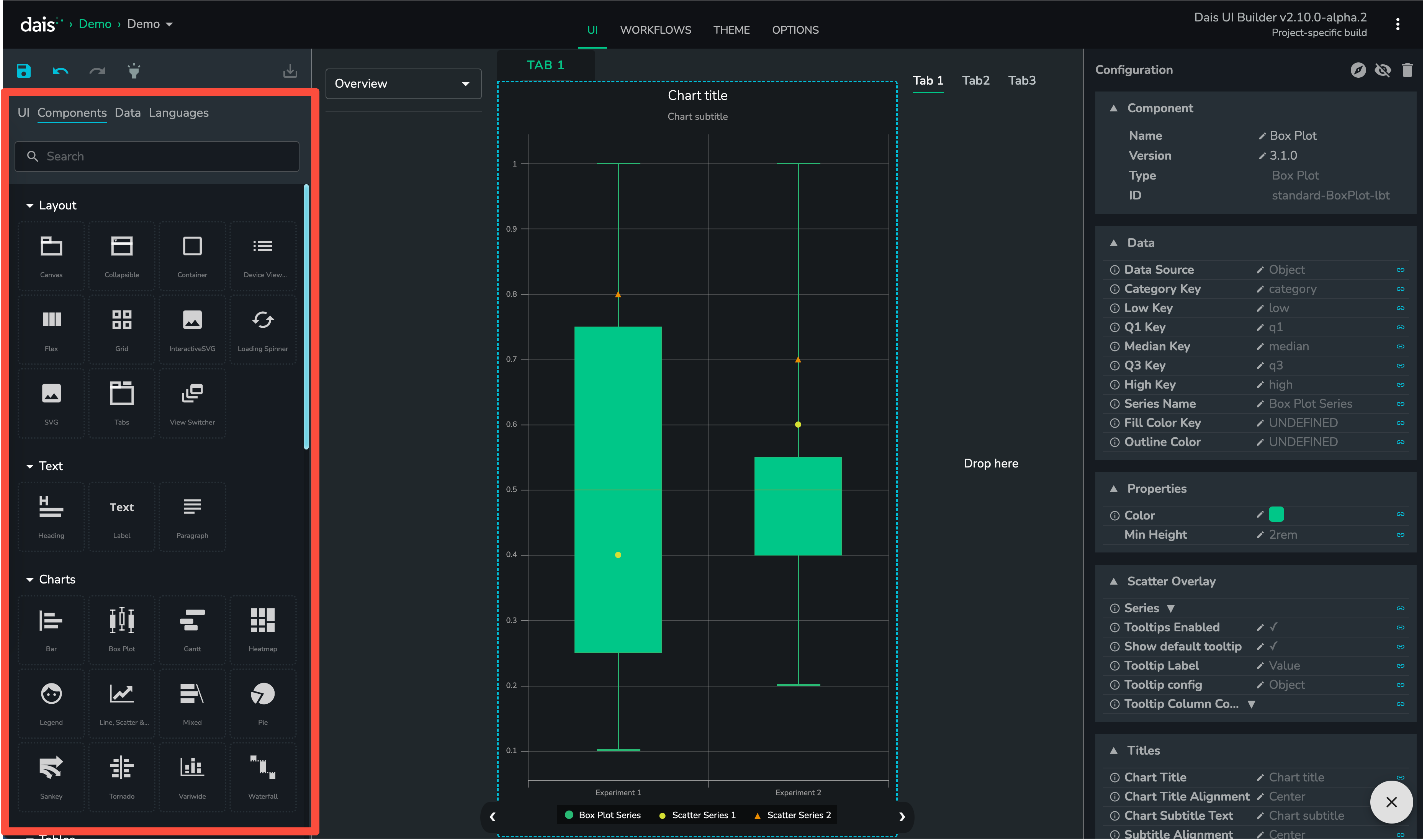
The component library is the second tab in the left-hand side panel of UI Builder. It allows you to drag and drop components onto the canvas (centre), control (left) or details (right) areas of your app.
It can be useful to start with the Container component, or else grid layout and then add different components into these structures.